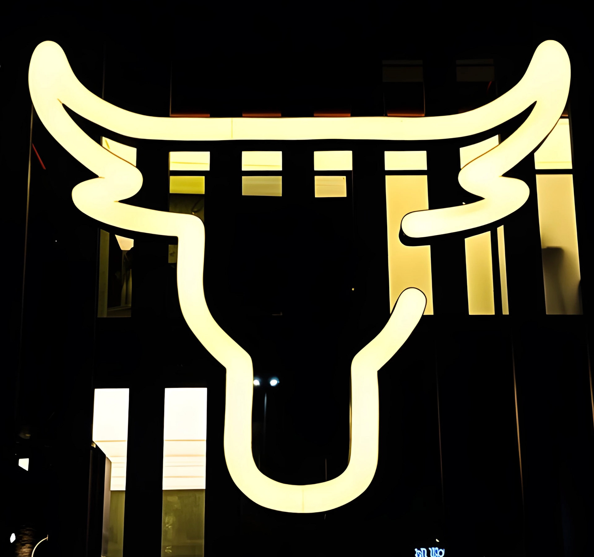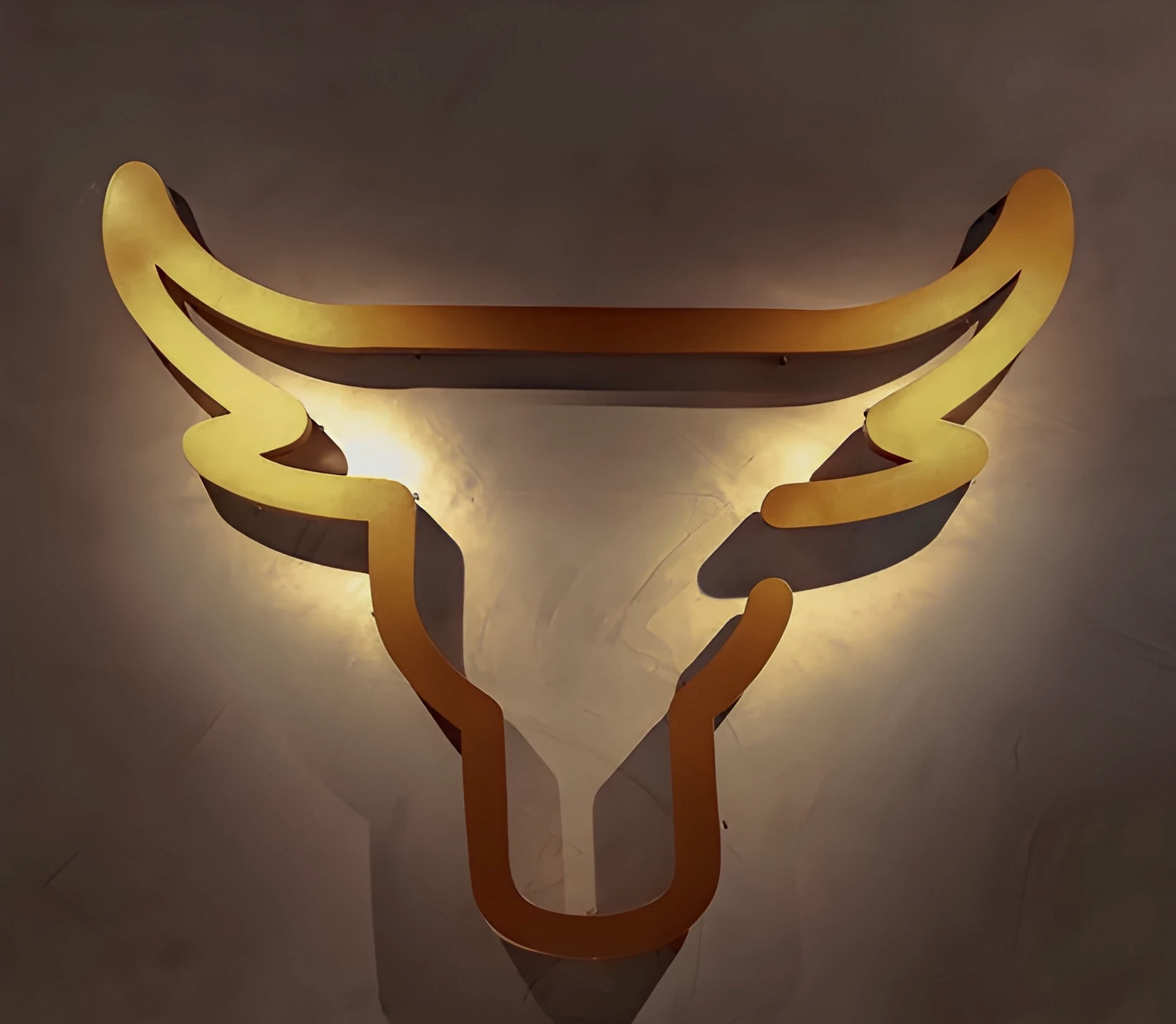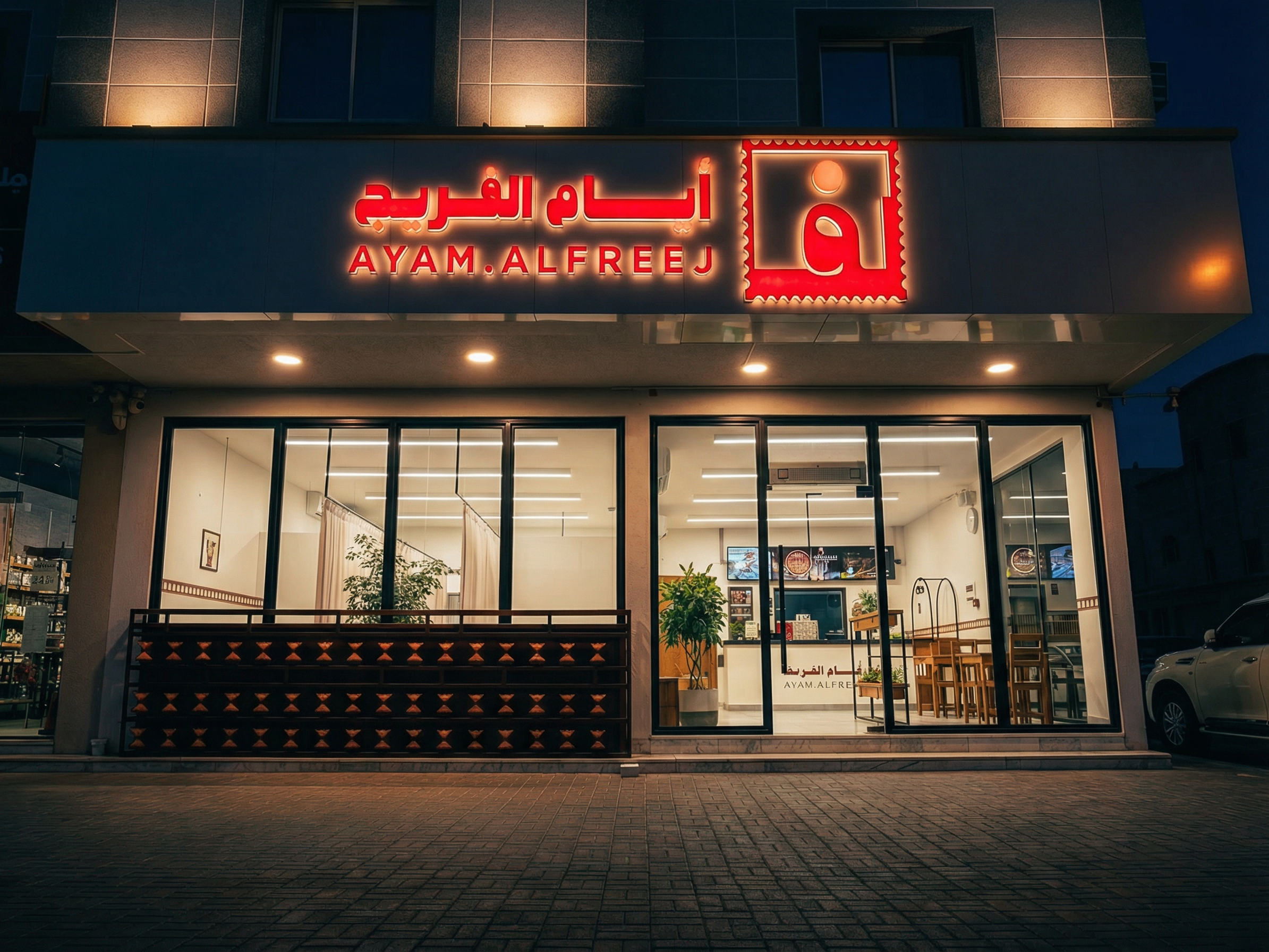
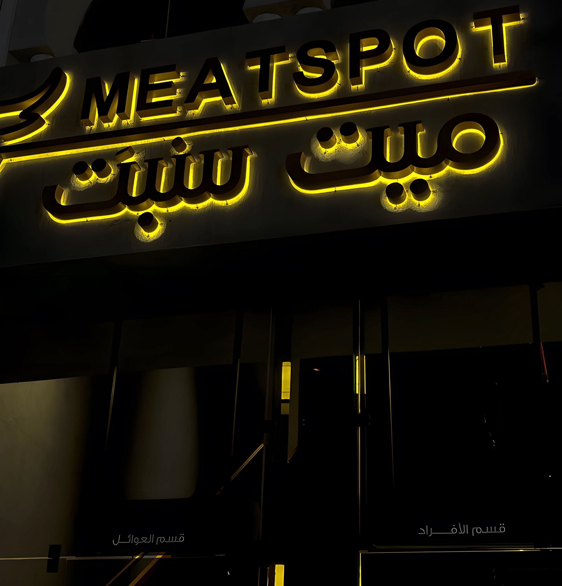
مطعم "ميت سبت" هو وجهة استثنائية لمحبي اللحوم، يقدم تجربة طعام فاخرة تتميز بالجودة والابتكار. ولتجسيد هذا التميز، كان من الضروري أن تعكس هوية المطعم الفريدة مفهومه ورؤيته بشكل بصري متميز. في ريفن، قمنا بتصميم هوية بصرية متكاملة تعكس الجودة والتميز الذي يسعى "ميت سبت" لتقديمه لعملائه. ركزنا على خلق شعار يعبر عن مفهوم المطعم من خلال تفاصيل دقيقة، حيث تم اختيار رأس البقرة كرمز رئيسي في الشعار، ليعكس القوة والصلابة ويرتبط ارتباطًا وثيقًا بعالم اللحوم. كان الهدف من هذا التصميم أن يكون الشعار معبرًا عن نوعية الطعام والخبرة الفريدة التي يقدمها المطعم. ولم نتوقف عند الشعار فقط، بل كانت هناك رؤية شاملة لبناء هوية بصرية متكاملة تضمن التميز في كل التفاصيل. تم دمج الشعار مع خطوط وتصاميم تعكس الاحترافية والعصرية، مما ساعد على خلق صورة قوية وواضحة تمثل هوية المطعم بشكل مميز وسهل التذكر. الشعار هنا ليس مجرد علامة تجارية، بل هو عنصر رئيسي في التجربة البصرية التي نقدمها لعملاء "ميت سبت". من خلال هذه الهوية، تم تنسيق التفاصيل الدقيقة والرمزية لتتناسب مع قيم المطعم، مضيفين لمسة من الحداثة والابتكار، بما يعكس رسالة تقديم أطباق اللحوم الاستثنائية في بيئة بصرية متكاملة.
"Meat Sept" is an exceptional destination for meat lovers, offering a luxurious dining experience characterized by quality and innovation. To reflect this excellence, it was essential that the restaurant’s identity visually embodies its unique concept and vision. At RAVEN, we designed a comprehensive visual identity that mirrors the quality and distinction that "Meat Sept" strives to offer its customers. We focused on creating a logo that captures the essence of the restaurant through intricate details, with the bull’s head selected as the central symbol. This symbol represents strength and solidity while establishing a strong connection to the world of meats. The design aimed to express both the type of food and the unique experience the restaurant provides. Our work didn’t stop with the logo alone; we adopted a holistic approach to build a cohesive visual identity that ensured excellence in every aspect. The logo was integrated with modern and professional typography, creating a strong, clear image that represented the restaurant’s identity in a memorable and distinctive way. The logo is not just a brand mark; it is an essential part of the overall visual experience we provide for "Meat Sept" customers. Through the careful coordination of detailed elements and symbolism, we added a touch of modernity and innovation, aligning the visual identity with the restaurant’s values and its message of serving exceptional meat dishes in a visually complete environment.
"Meat Sept" is an exceptional destination for meat lovers, offering a luxurious dining experience characterized by quality and innovation. To reflect this excellence, it was essential that the restaurant’s identity visually embodies its unique concept and vision. At RAVEN, we designed a comprehensive visual identity that mirrors the quality and distinction that "Meat Sept" strives to offer its customers. We focused on creating a logo that captures the essence of the restaurant through intricate details, with the bull’s head selected as the central symbol. This symbol represents strength and solidity while establishing a strong connection to the world of meats. The design aimed to express both the type of food and the unique experience the restaurant provides. Our work didn’t stop with the logo alone; we adopted a holistic approach to build a cohesive visual identity that ensured excellence in every aspect. The logo was integrated with modern and professional typography, creating a strong, clear image that represented the restaurant’s identity in a memorable and distinctive way. The logo is not just a brand mark; it is an essential part of the overall visual experience we provide for "Meat Sept" customers. Through the careful coordination of detailed elements and symbolism, we added a touch of modernity and innovation, aligning the visual identity with the restaurant’s values and its message of serving exceptional meat dishes in a visually complete environment.
اللمسة النهائية final touch
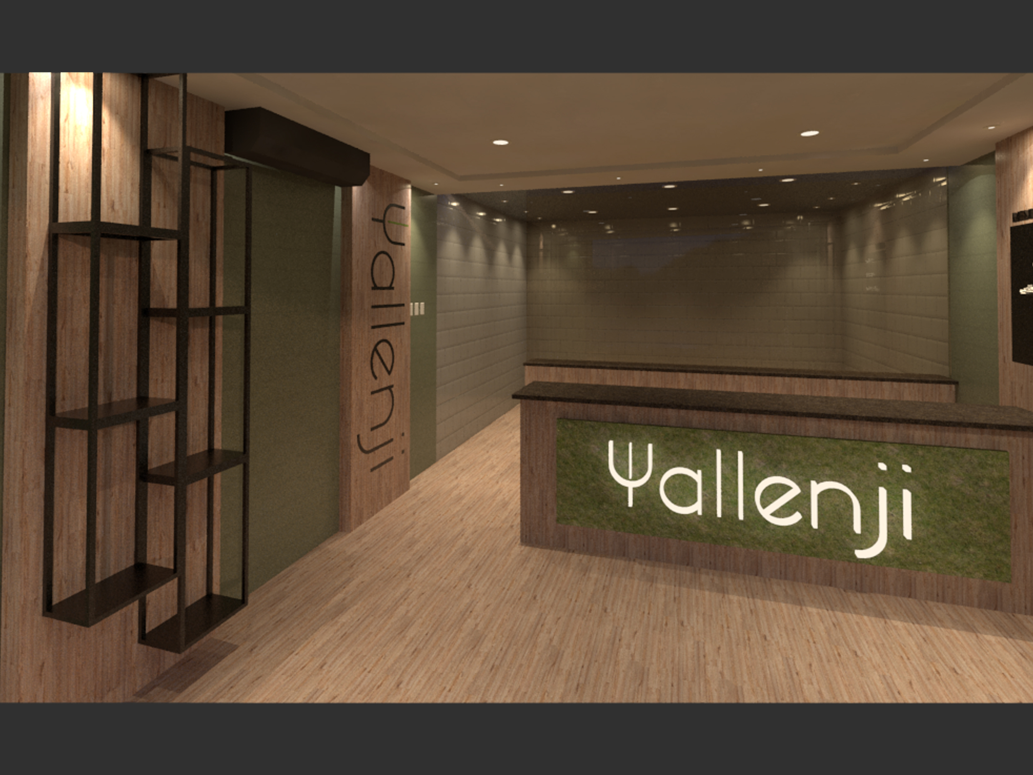
في مطعم "ميت سبت"، كانت اللمسة النهائية هي العنصر الحاسم الذي أكمل روعة المشروع وجعل الهوية البصرية تنبض بالحياة. تركزت هذه اللمسة على تحقيق التوازن بين التفاصيل الفنية والدقة العملية، حيث تم تنفيذ التصاميم بأسلوب مبتكر يعكس جوهر العلامة التجارية.
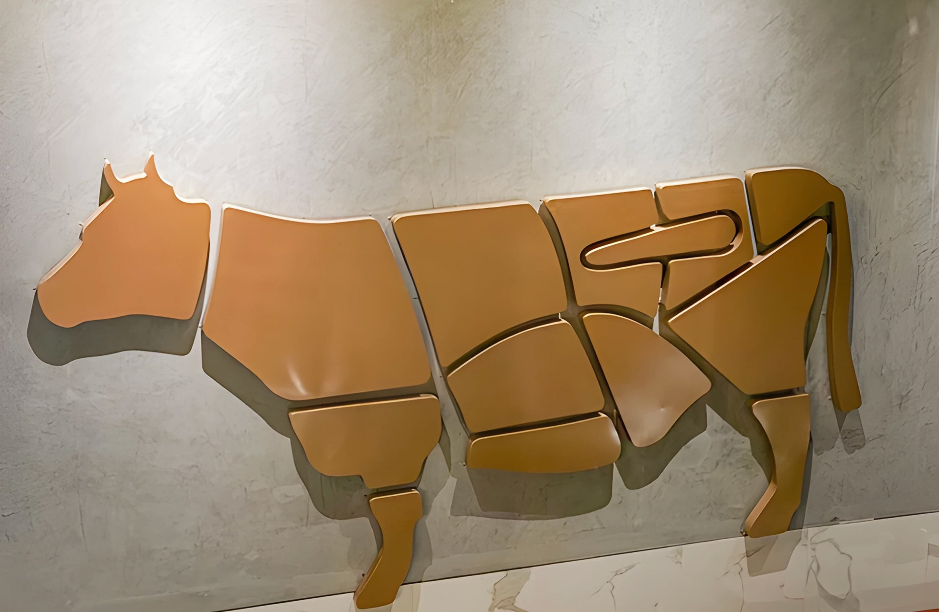
ابتداءً من الشعار البارز الذي يزين المدخل برقي وأناقة، إلى الجدران التي تحمل تصاميم مبتكرة مثل القطعة الفنية المتمثلة في أجزاء البقرة، والتي تجسد احترافية التصميم وعمق الفكرة. تم اختيار الخامات بعناية فائقة لضمان الجودة والمتانة، مع مراعاة الانسجام بين الألوان والتصاميم الداخلية.
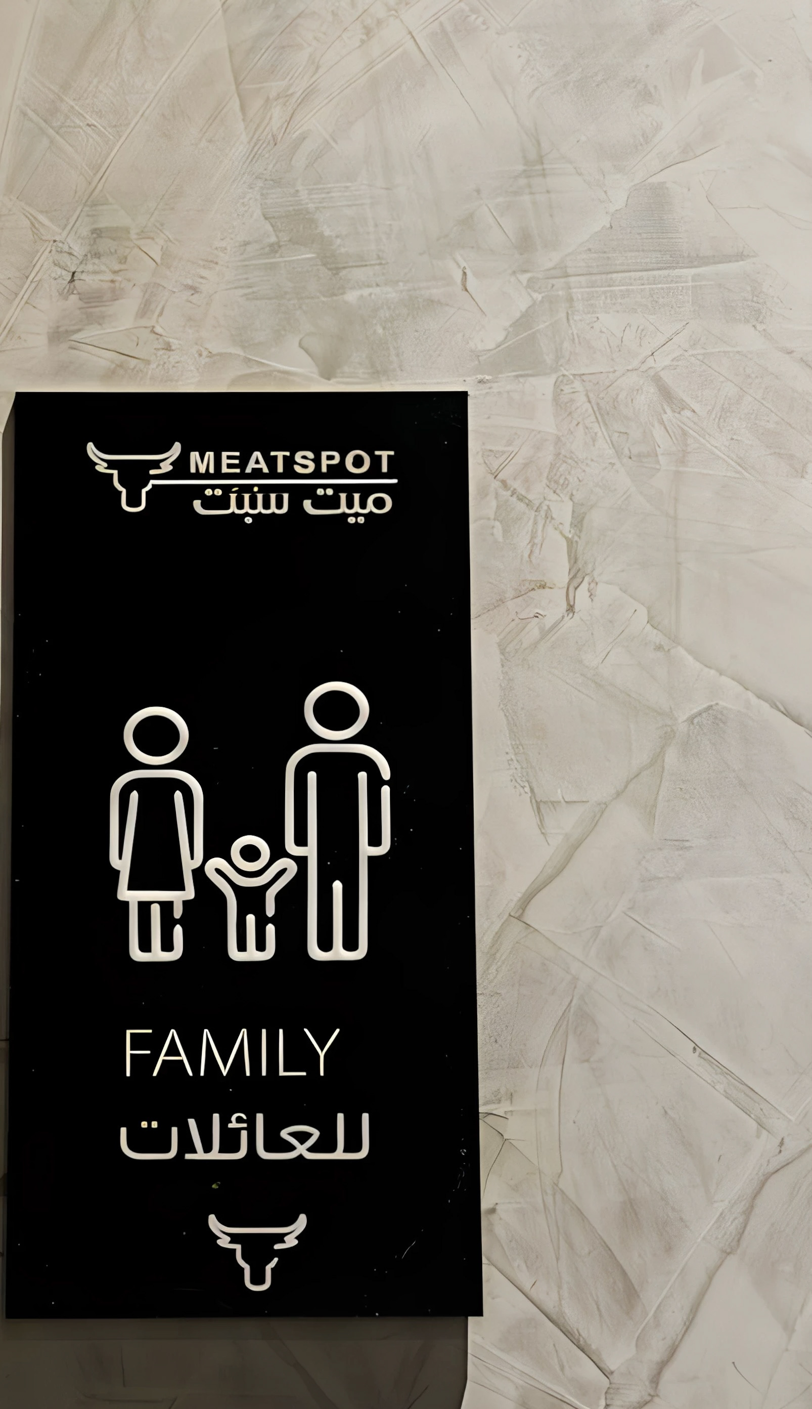
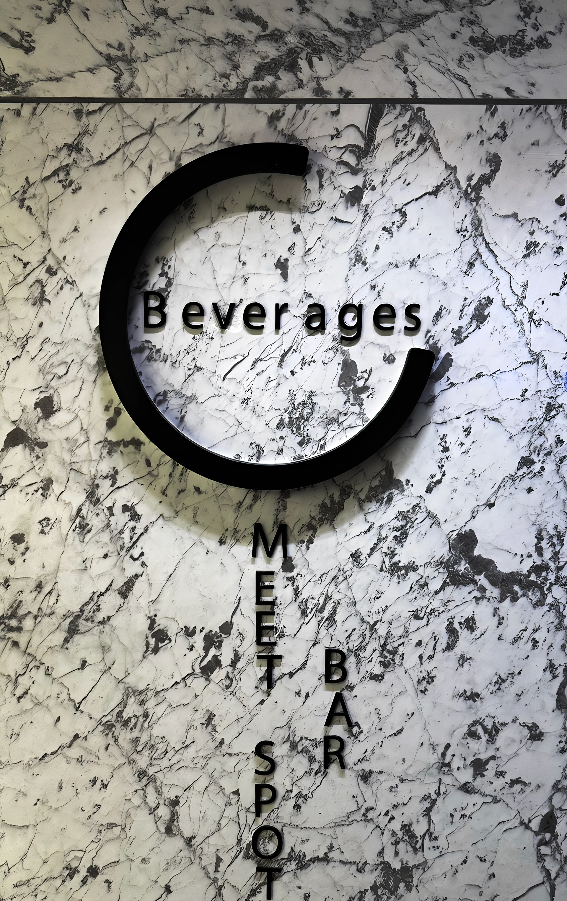
كما تم تعزيز الهوية البصرية من خلال اللوحات الإرشادية المصممة بدقة، حيث تعكس الوضوح والأناقة مع الحفاظ على التناسق مع بقية عناصر التصميم. اللمسة النهائية لم تكن فقط في التصاميم البصرية، بل امتدت إلى كل تفصيل في المكان، مما جعل التجربة الشاملة للزوار مليئة بالفخامة والتميز.
At Meat Sept, the final touch was the defining element that completed the beauty of the project and brought the visual identity to life. This touch focused on achieving a balance between artistic details and practical precision, with designs executed in an innovative style that reflects the essence of the brand.
From the prominent logo that adorns the entrance with sophistication and elegance to the walls featuring creative designs like the artistic piece representing the cuts of a cow, every element embodies the professionalism and depth of the concept. The materials were carefully selected to ensure quality and durability while maintaining harmony between colors and interior designs.
The visual identity was further enhanced through meticulously designed signage that reflects clarity and elegance while staying consistent with the other design elements. The final touch wasn’t limited to the visual designs alone; it extended to every detail in the space, making the overall experience for visitors one of luxury and distinction.