ريڤين — حيث تتحول الرؤية إلى واقع
TURNING VISION INTO REALITY
TURNING VISION INTO REALITY
من نحن
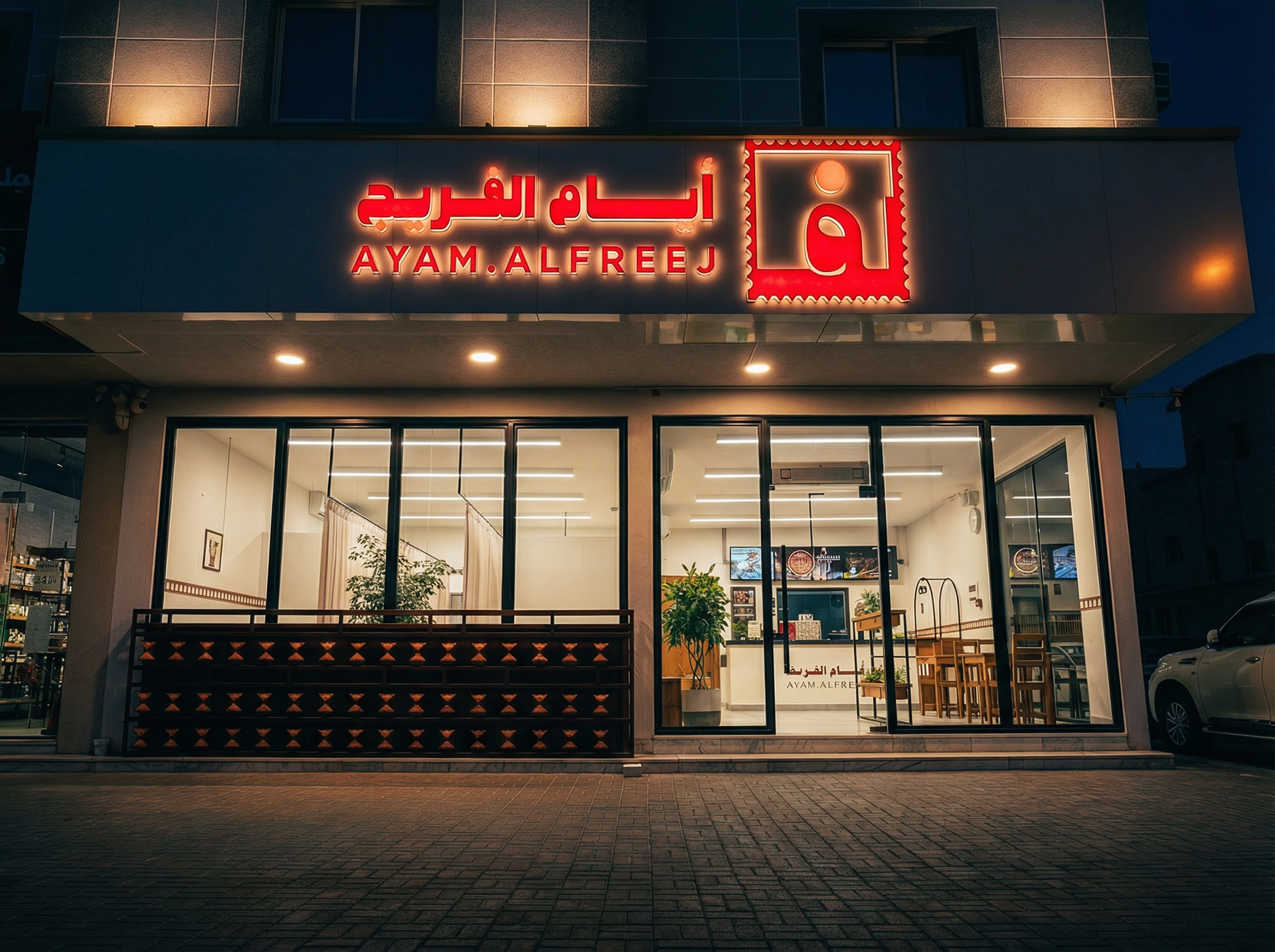
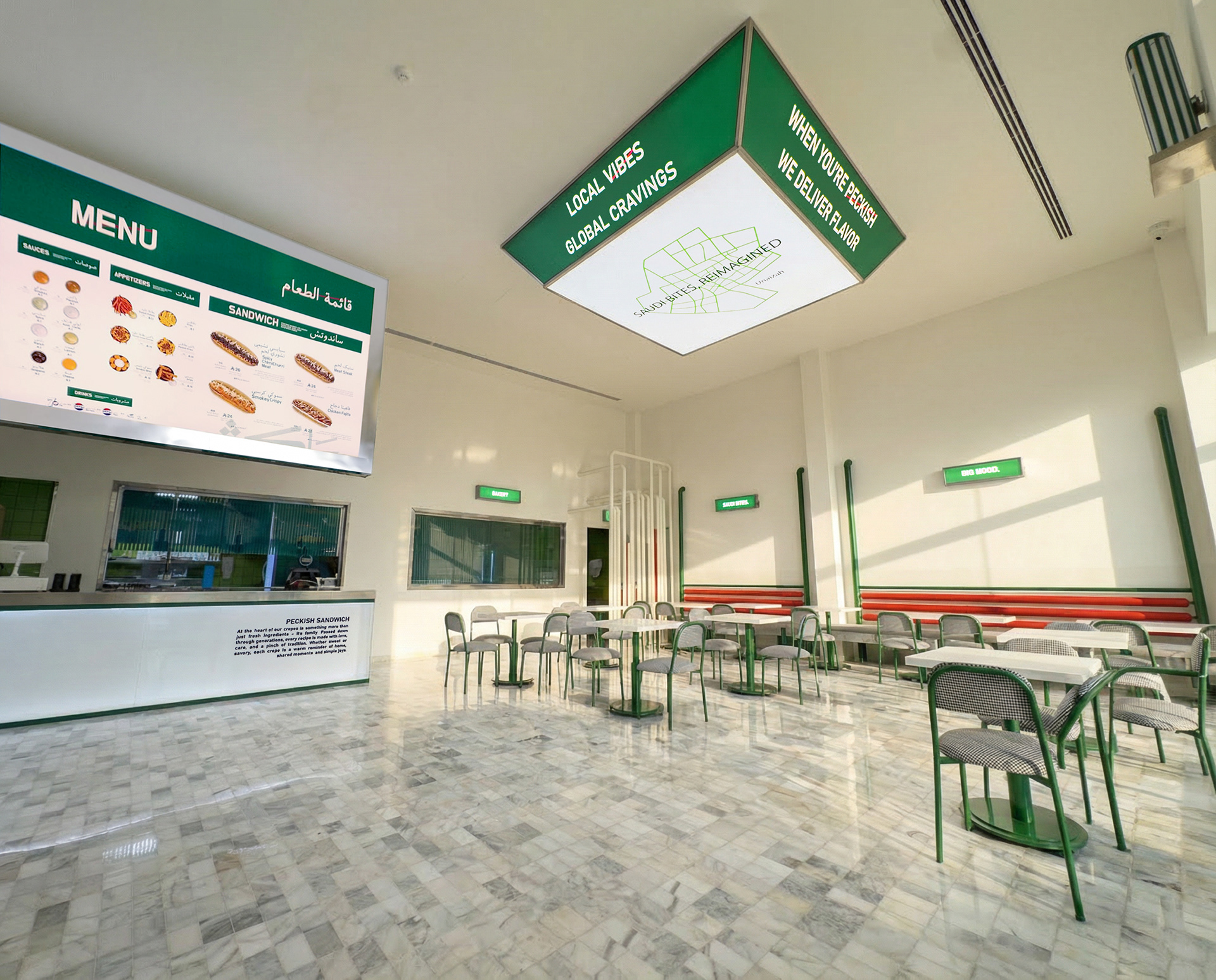
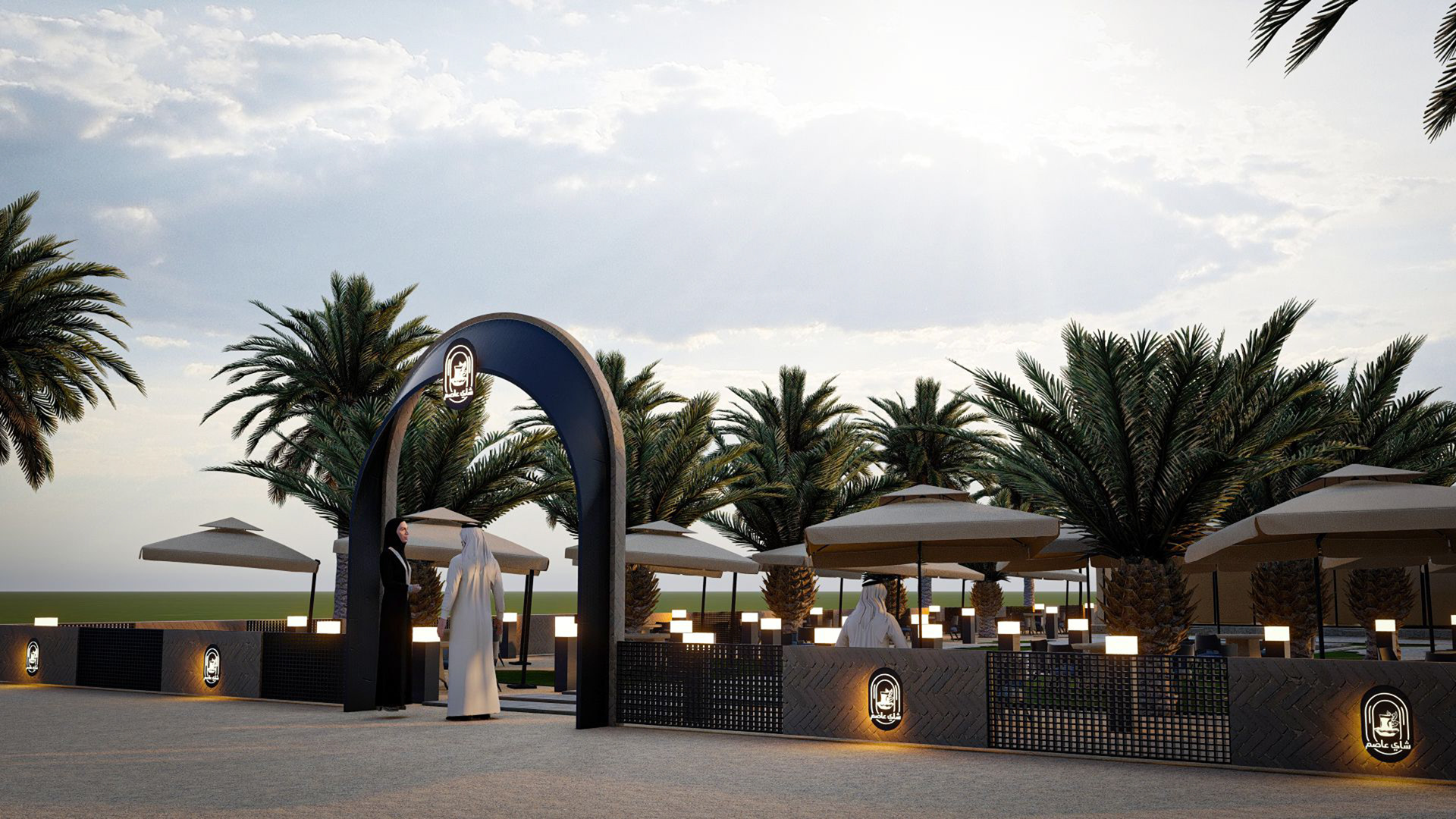
نحن شركة متخصصة في تطوير المشروعات، والتصميم الداخلي، وبناء الهويات التجارية، وأعمال التشطيبات النهائية، نقدم حلولًا متكاملة وفق منهجية مدروسة تضمن تحقيق أعلى مستويات الجودة والكفاءة.
نعتمد في عملنا على التخطيط الاستراتيجي، والدقة في التنفيذ، والالتزام بأفضل المعايير المهنية، حيث ندير جميع مراحل المشروع بدءًا من دراسة الفكرة والتصميم، وصولًا إلى التنفيذ وأعمال الفاينال تاتش، بما يحقق التكامل بين الجوانب الجمالية والوظيفية
نلتزم بتقديم نتائج تعكس هوية عملائنا وتلبي تطلعاتهم، مع الحرص على الالتزام بالجداول الزمنية ومعايير الجودة المعتمدة، بما يضمن استدامة المشروع وتعزيز قيمته
.هدفنا هو بناء شراكات طويلة الأمد قائمة على الثقة، والاحترافية، والتميز في الأداء
أقسام الشركة
لمشاهدة الأعمال